A look at crisis infographics: how information design can help. Our recent win of the Grand Prix award for our 'keeping warm in the winter' leaflet has inspired us to delve further into the disaster relief and preparation sector. The leaflet for the charity CARE, utilizes information design techniques to provide Syrian refugees with information on how they can 'winterise' their shelters.
Information design is the practice of organising data in a way that facilitates its understanding. Rather than visual appeal, the purpose of information design is effective communication.
“Modern life is saturated with complex information and data. For information to have impact, it must be easy to find, simple to use, and instantly understandable. In short, information needs to be designed!”
Information Design Association
How Information Design has aided in Disaster Relief and Preparation
Recent world events have inspired us to create a new division at TDL-London called Crisis Infographics. The purpose of which is to explore possible applications of information design in assisting at-risk individuals in emergency situations.
We believe information design can be crucial in disaster situations. From preparing for the event to coping in the aftermath, information design methods ensure communications are:
- Inclusive
- Easily understood
- Understood quickly
- Designed for action, rather than purely aesthetic
- Clear, organised and concise
We’ve divided our research of current crisis infographics into the following categories:
- Guides
- Geographics
- Step by Step
- Education
1 Guides
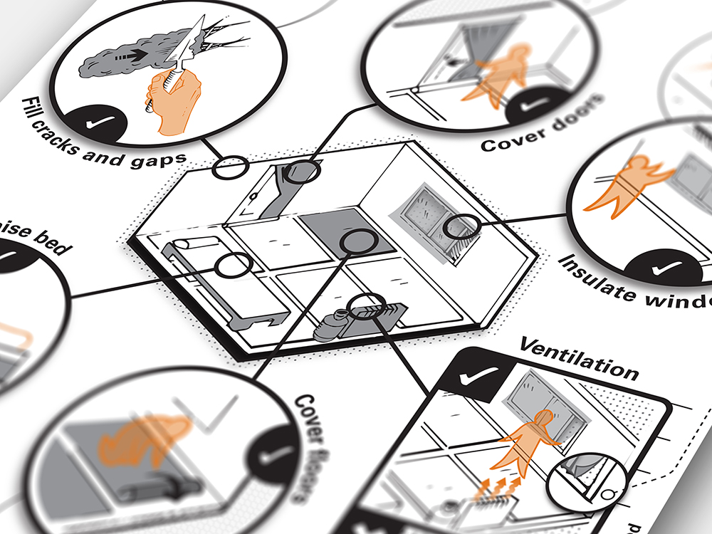
Example 1.1: Instruction Manual for Syrian Refugees
by TDL-London and CARE
Information design methods: ‘How to’ illustration + good/bad practice + bilingual
The Middle East can experience severe winter weather, with powerful snowstorms, heavy rainfall, hail, and strong winds. This manual provided clear instructions, by highlighting best practice using simple visuals, on how refugees can best maintain their temporary homes and themselves to keep warm. It effectively spans language and cultural gaps as there are both English and Arabic versions.
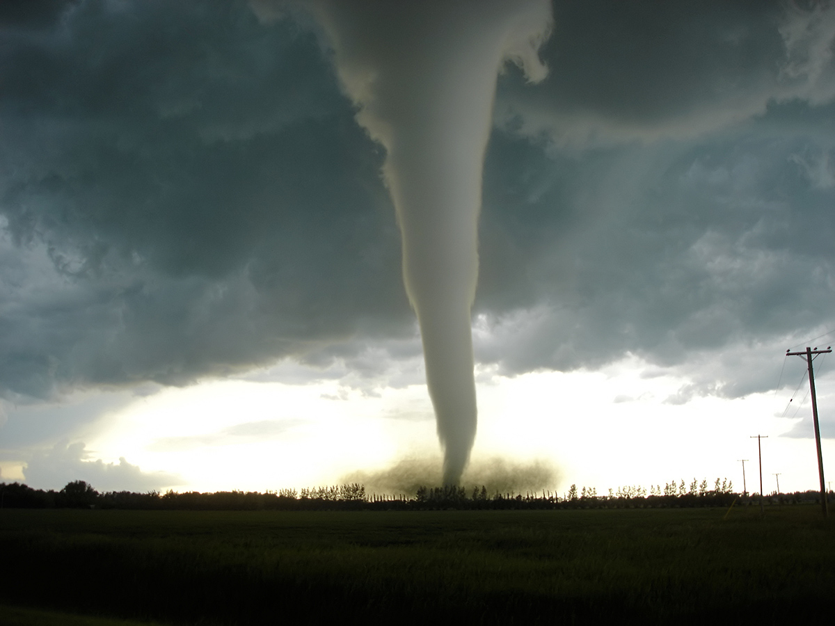
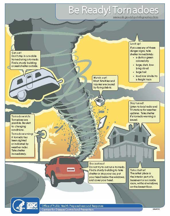
Example 1.2: ‘Be Ready!’ Series for Individuals in Natural Disaster Prone Areas
by Center for Disease Control
Information design methods: Pull out boxes + illustrated scenario
This series of infographics describes how to prepare and keep safe during natural disasters such as tornadoes, hurricanes, earthquakes, and wildfires. The poster shows the environment and highlights warnings on key elements. It’s not designed for use in the event, but more of a learning tool to educate before a tornado strikes
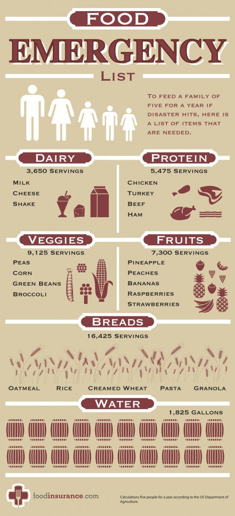
Example 1.3: Food Emergency List for Parents and Guardians
by Food Insurance
Information design methods: editorial infographic
Food Insurance produces meals with up to a 25-year shelf-life so that individuals can readily access stored food in the event of emergency situations. Food Insurance also provides a vast amount of information and products to help families and individuals prepare for disastrous situations. The infographic lists the necessary types and amounts of food a family of five needs to survive for a year. It might have been useful to find out how to store it all though!
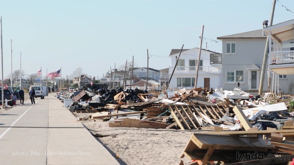 Sandy Super Storm, Major John Adams, Army, lynda.com
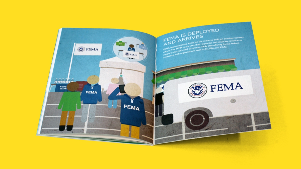
Example 1.4: Community Disaster Recovery Playbook for Sandy Super Storm Victims
by Frog & FEMA
Information design methods: Illustrated information manual + visual story telling
After disaster strikes (such as the Sandy Super Storm, 2012, with the aftermath pictured), survivors can wait days or even weeks before government aid arrives. Frog collaborated with FEMA to create a ‘playbook’ that depicts how communities can address this time and help themselves. In the book they suggest how to set up a disaster recovery center by collaborating with local businesses and national franchises. This allows the community to sustain itself while it waits for government assistance.
2 Geographic
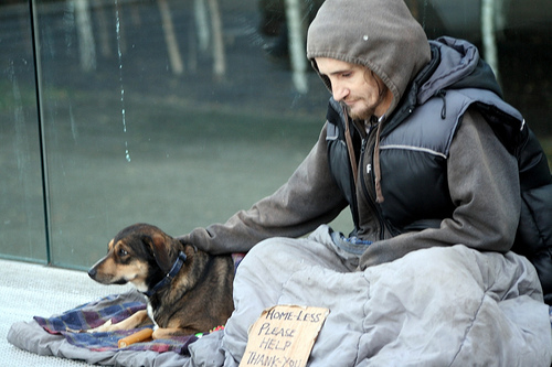
Example 2.1: Survival Guide for the Homeless
Information design methods: Fold out map + iconography
The United Nations estimated that 100 million people were homeless in 2005, because of differences in classifications of homelessness between countries, the number is likely much higher. This pocket-sized booklet includes a detailed map indicating the locations of water fountains, toilets and help centers for the homeless. The booklet also comes with a pair of socks and provides further information on help centers such as phone numbers and transportation to them.
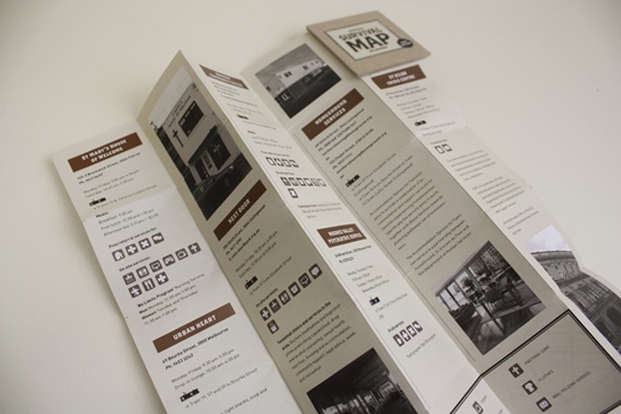
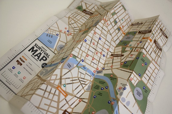
One side provides in depth information on help centers and other services available to the homeless, while the other shows an informational Map of amenities available to the homeless in the Melbourne, Australia area.
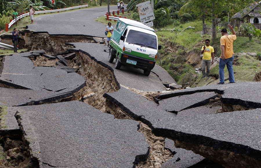
Example 2.2: Seismi, Digital visualization project for individuals in regions prone to earthquakes
by Niko Knappe and Gokce Taskan
Information design methods: Interactive map
This interactive system allows researchers and the general public to understand past earthquakes (such as the one pictured in The Philippines, 2010) in reference to time, location, and scale, thus making more accurate preparations for the future.
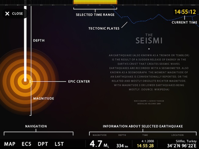
The Seismi website transforms publicly available data provided by USGS into an easily readable interactive site.
Example 2.3: Tsunami evacuation map for residents of Northern Japan
Information design methods: Heat map + iconography + time measures + contour lines
The map provides residents with the relevant information necessary to evacuate the city. Shelters and escape routes are clearly identified. Because cars lead to traffic jams, distance is marked in reference to time so that individuals can plan out the quickest path to safety.
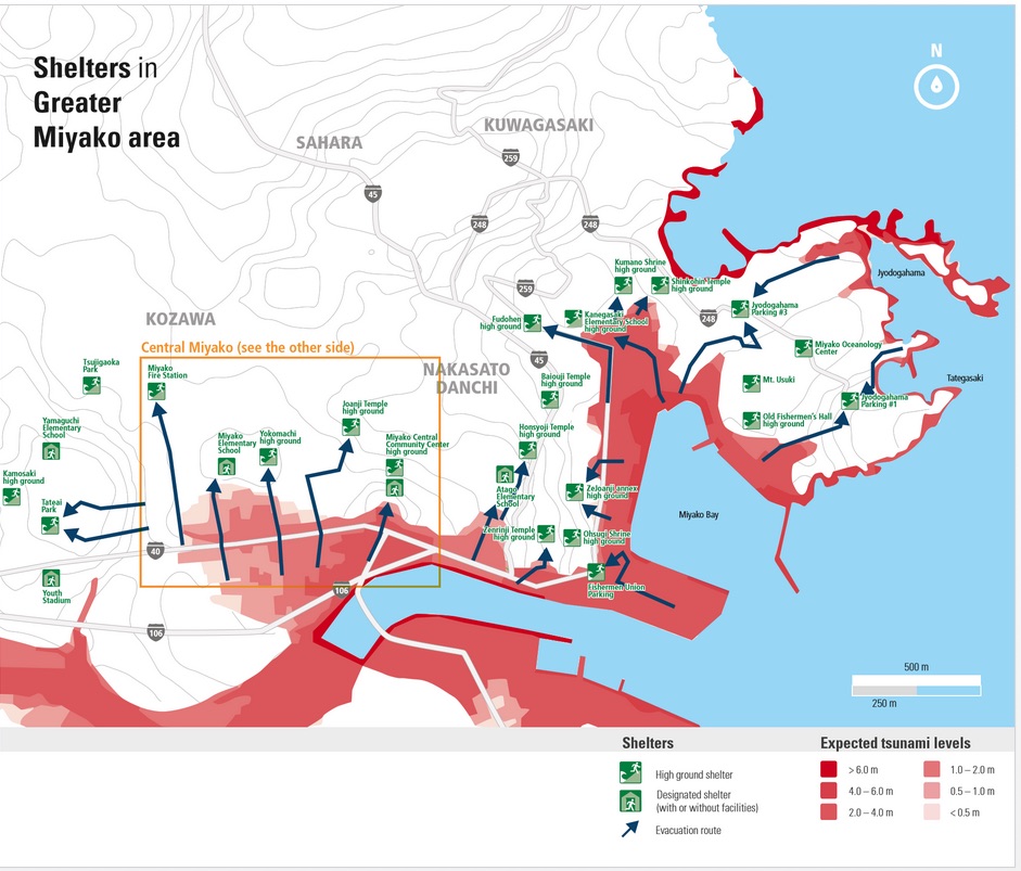
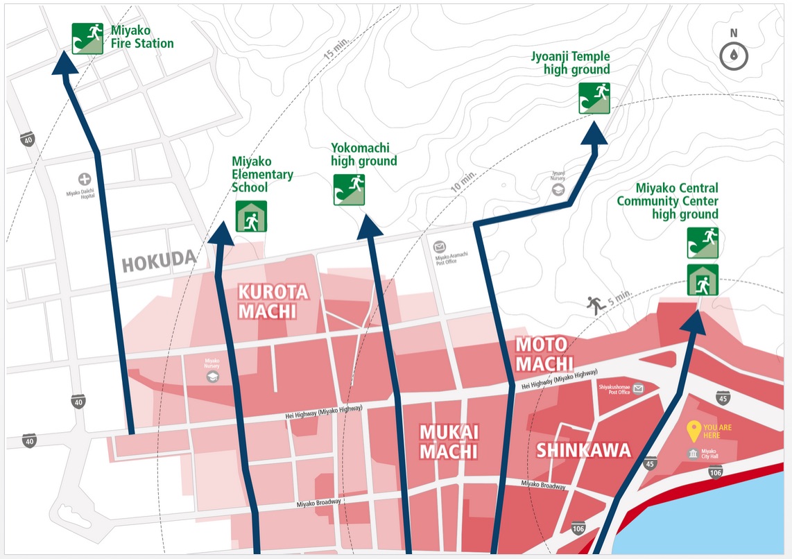
Evacuation map of Miyako, Japan, followed by a zoomed in view of central Miyako area. Of Japan’s east coast, the area was one of the most severely affected after being hit by a Tsunami on March 11, 2011.
3 Step by Step
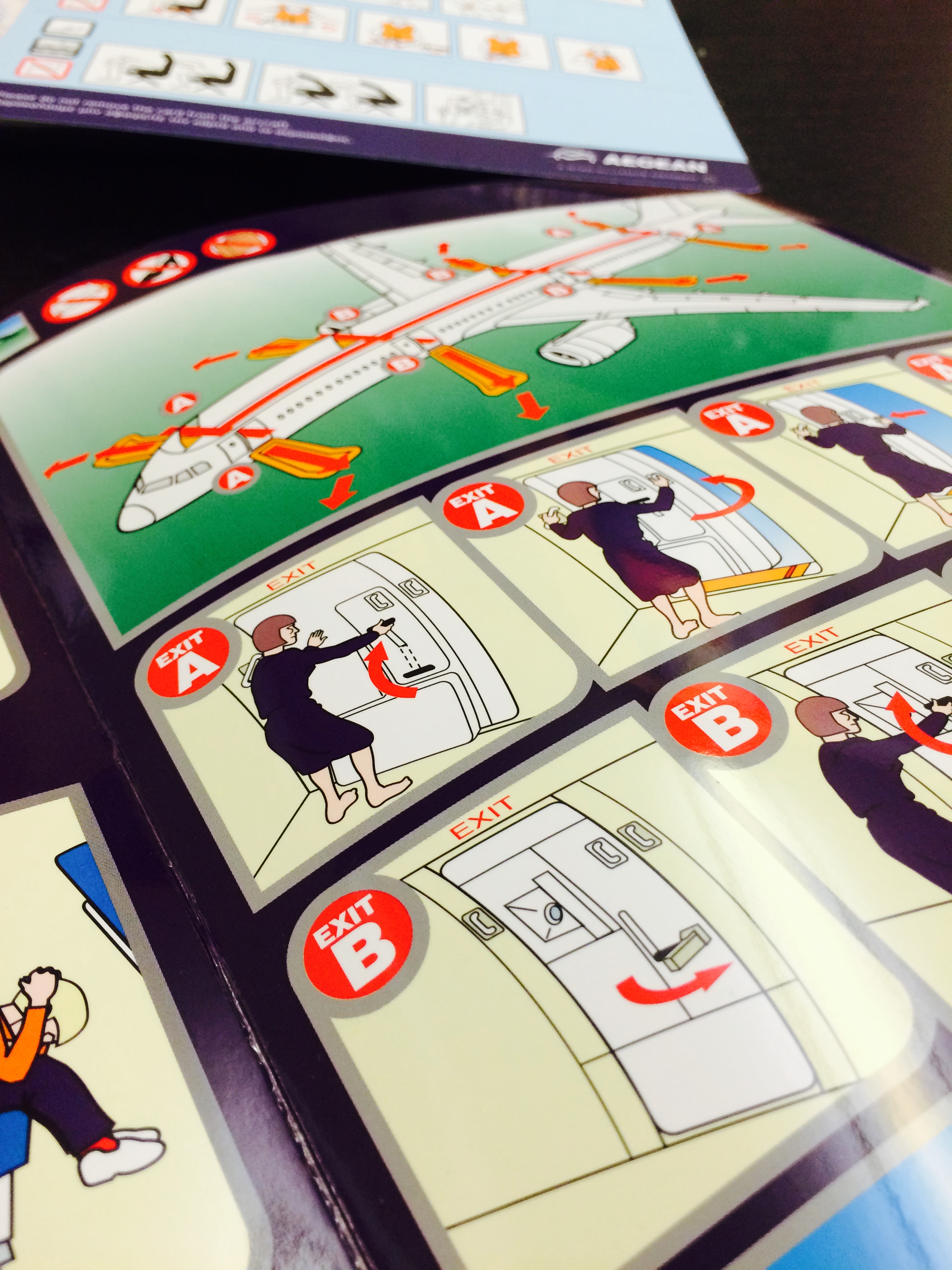
Example 3.1: Inflight safety measures for passengers
by FirstChoice Airways
Information design methods: Iconography + illustration + cutaways
Airlines aim to maximize passenger safety by providing procedural instructions on take off for emergencies such as unexpected landings, low cabin pressure and turbulence. This step by step provides passengers with clear instructions on how to exit the aircraft in an emergency. Much of the information is shown pictorially due to the different languages of readers.
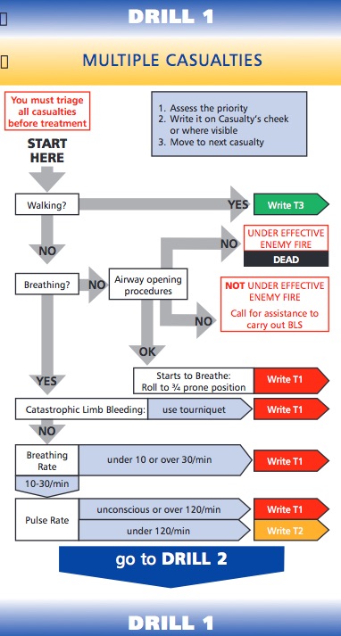
Example 3.2: Battlefield Casualty Drills for Soldiers in Action
by Broadlands Squadron
Information design methods: Decision tree
This is a detailed step-by-step that explains to soldiers how to handle injuries and casualties on the battlefield – it aims to improve soldier safety and survival. The full manual provides instructions on various situations. Communication must be clear and concise due to the environment in which these diagrams are used.
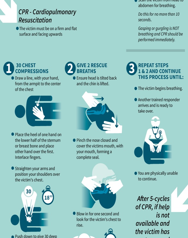
Example 3.3: CPR First Aid, ‘How To’ for CPR Certified
by Indigo Medical Training
Information design methods: Illustration + directional arrows +numbered process + cutaway elements
According to the American Heart Association, CPR can triple a victim’s chance of survival, but only 32% of cardiac arrest victims receive CPR from a bystander. This manual aims to prevent unnecessary death by explaining the process of CPR. Numbers and illustrations are used to show how to perform CPR. Arrows are used to show pressure, with cutaways to highlight airways.
4 Education
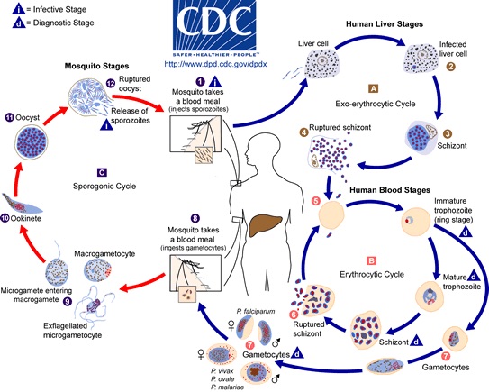
Example 4.1: Malaria Life Cycle for Disease Stricken Areas
by the CDC
Information design methods: Illustration (real life rather than schematic) + steps + colour coding of various cycles
According to the World Health Organization (WHO), there were 207 million cases of malaria worldwide and 627,000 deaths in 2012. This diagram assists the understanding of how Malaria is transmitted and thus provides insight on how individuals can avoid contraction. The diagram shows the stages of malaria transmission in both humans and mosquitos. The language used might be more applicable to people educated in the matter of malaria – A diagram for the actual people at risk may be designed completely differently.
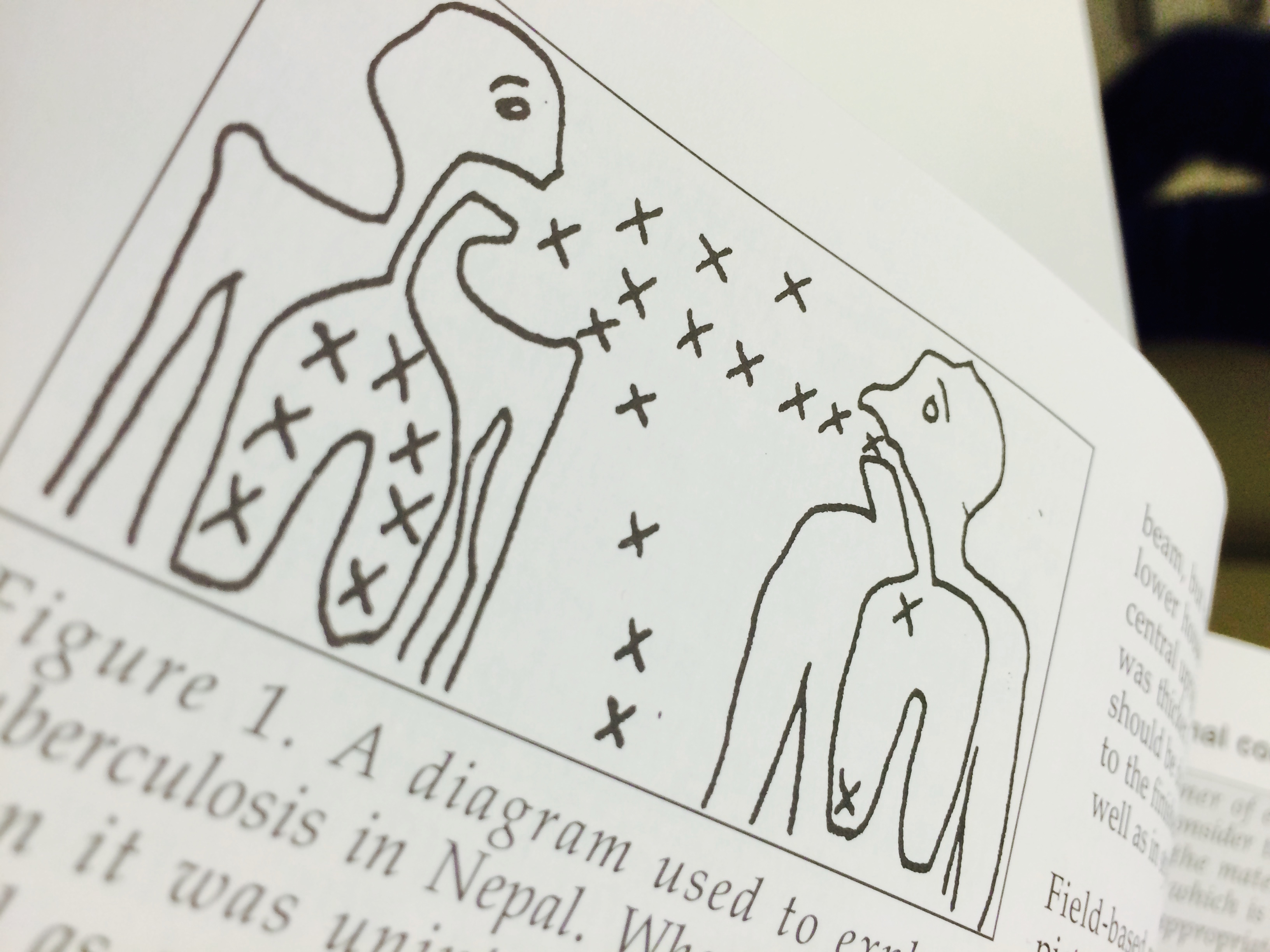
Example 4.2: Tuberculosis Diagram for Nepal Citizens
by Ane Haaland and Diana Fussell
Information design methods: Hand drawn illustration
Used as a teaching tool to communicate the person-to-person transmission of Tuberculosis in Nepal. TB spreads easily from a cough or sneeze so it is important that those infected cover their mouths and noses to prevent infecting others.
To summarise
There are a number of examples of crisis infographics we have found, that utilise information design techniques and design methods to enable clear understanding.
However, we have found it difficult to find examples that have been provided to at-risk people within developing countries. These communications would be a great challenge to any designer as traditional approaches may not be understood, and meanings misinterpreted. We predict the following challenges would need to be addressed:
- Design speed and rapid design development
- User testing and working with the readers
- Interpretation, e.g. icons Vs illustration
- Cost of deployment – printing on site in disaster zones
- Language barriers
- Understanding of common design layouts, e.g. timelines and step-by-step
Due to the extreme situations when these crisis infographics would be required, we think developments in this area could have a profound effect on the people reading the information. It is pure information design, where branding and ‘look & feel’ take a back seat, whereas clear understanding and user-centric design are at the forefront of graphic communication solutions.